Table
Documentation for the `table` function.
A table of items.
Tables are used to arrange content in cells. Cells can contain arbitrary content, including multiple paragraphs and are specified in row-major order. For a hands-on explanation of all the ways you can use and customize tables in Typst, check out the Table Guide.
Because tables are just grids with different defaults for some cell properties (notably stroke and inset), refer to the grid documentation for more information on how to size the table tracks and specify the cell appearance properties.
If you are unsure whether you should be using a table or a grid, consider whether the content you are arranging semantically belongs together as a set of related data points or similar or whether you are just want to enhance your presentation by arranging unrelated content in a grid. In the former case, a table is the right choice, while in the latter case, a grid is more appropriate. Furthermore, Assistive Technology (AT) like screen readers will announce content in a table as tabular while a grid's content will be announced no different than multiple content blocks in the document flow. AT users will be able to navigate tables two-dimensionally by cell.
Note that, to override a particular cell's properties or apply show rules on table cells, you can use the table.cell element. See its documentation for more information.
Although the table and the grid share most properties, set and show rules on one of them do not affect the other. Locating most of your styling in set and show rules is recommended, as it keeps the table's actual usages clean and easy to read. It also allows you to easily change the appearance of all tables in one place.
To give a table a caption and make it referenceable, put it into a figure.
Example
The example below demonstrates some of the most common table options.
#table( columns: (1fr, auto, auto), inset: 10pt, align: horizon, table.header( [], [*Volume*], [*Parameters*], ), image("cylinder.svg"), $ pi h (D^2 - d^2) / 4 $, [ $h$: height $D$: outer radius $d$: inner radius ], image("tetrahedron.svg"), $ sqrt(2) / 12 a^3 $, [$a$: edge length])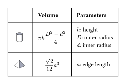
Much like with grids, you can use table.cell to customize the appearance and the position of each cell.
Accessibility
Tables are challenging to consume for users of Assistive Technology (AT). To make the life of AT users easier, we strongly recommend that you use table.header and table.footer to mark the header and footer sections of your table. This will allow AT to announce the column labels for each cell.
Because navigating a table by cell is more cumbersome than reading it visually, you should consider making the core information in your table available as text as well. You can do this by wrapping your table in a figure and using its caption to summarize the table's content.
#table(
  columns: auto | int | relative | fraction | array,
  rows: auto | int | relative | fraction | array,
  gutter: auto | int | relative | fraction | array,
  column-gutter: auto | int | relative | fraction | array,
  row-gutter: auto | int | relative | fraction | array,
  inset: relative | array | dictionary | function,
  align: auto | array | alignment | function,
  fill: none | color | gradient | array | tiling | function,
  stroke: none | length | color | gradient | array | stroke | tiling | dictionary | function,
  children
) -> content
Parameters
Prop
Type
Definitions
A cell in the table. Use this to position a cell manually or to apply styling. To do the latter, you can either use the function to override the properties for a particular cell, or use it in show rules to apply certain styles to multiple cells at once.
Perhaps the most important use case of table.cell is to make a cell span multiple columns and/or rows with the colspan and rowspan fields.
For example, you can override the fill, alignment or inset for a single cell:
You may also apply a show rule on table.cell to style all cells at once. Combined with selectors, this allows you to apply styles based on a cell's position:
#table.cell(
  body,
  x: auto | int,
  y: auto | int,
  colspan: int,
  rowspan: int,
  inset: auto | relative | dictionary,
  align: auto | alignment,
  fill: none | auto | color | gradient | tiling,
  stroke: none | length | color | gradient | stroke | tiling | dictionary,
  breakable: auto | bool
) -> content
Parameters
Prop
Type
A horizontal line in the table.
Overrides any per-cell stroke, including stroke specified through the table's stroke field. Can cross spacing between cells created through the table's column-gutter option.
Use this function instead of the table's stroke field if you want to manually place a horizontal line at a specific position in a single table. Consider using table's stroke field or table.cell's stroke field instead if the line you want to place is part of all your tables' designs.
#table.hline(
  y: auto | int,
  start: int,
  end: none | int,
  stroke: none | length | color | gradient | stroke | tiling | dictionary,
  position: alignment
) -> content
Parameters
Prop
Type
A vertical line in the table. See the docs for grid.vline for more information regarding how to use this element's fields.
Overrides any per-cell stroke, including stroke specified through the table's stroke field. Can cross spacing between cells created through the table's row-gutter option.
Similar to table.hline, use this function if you want to manually place a vertical line at a specific position in a single table and use the table's stroke field or table.cell's stroke field instead if the line you want to place is part of all your tables' designs.
#table.vline(
  x: auto | int,
  start: int,
  end: none | int,
  stroke: none | length | color | gradient | stroke | tiling | dictionary,
  position: alignment
) -> content
Parameters
Prop
Type
A repeatable table header.
You should wrap your tables' heading rows in this function even if you do not plan to wrap your table across pages because Typst uses this function to attach accessibility metadata to tables and ensure Universal Access to your document.
You can use the repeat parameter to control whether your table's header will be repeated across pages.
Currently, this function is unsuitable for creating a header column or single header cells. Either use regular cells, or, if you are exporting a PDF, you can also use the pdf.header-cell function to mark a cell as a header cell. Likewise, you can use pdf.data-cell to mark cells in this function as data cells. Note that these functions are not final and thus only available when you enable the a11y-extras feature (see the PDF module documentation for details).
#table.header(
  repeat: bool,
  level: int,
  children
) -> content
Parameters
Prop
Type
A repeatable table footer.
Just like the table.header element, the footer can repeat itself on every page of the table. This is useful for improving legibility by adding the column labels in both the header and footer of a large table, totals, or other information that should be visible on every page.
No other table cells may be placed after the footer.
#table.footer(
  repeat: bool,
  children
) -> content
Parameters
Prop
Type