Grid
Documentation for the `grid` function.
Arranges content in a grid.
The grid element allows you to arrange content in a grid. You can define the number of rows and columns, as well as the size of the gutters between them. There are multiple sizing modes for columns and rows that can be used to create complex layouts.
While the grid and table elements work very similarly, they are intended for different use cases and carry different semantics. The grid element is intended for presentational and layout purposes, while the table element is intended for, in broad terms, presenting multiple related data points. Set and show rules on one of these elements do not affect the other. Refer to the Accessibility Section to learn how grids and tables are presented to users of Assistive Technology (AT) like screen readers.
Sizing the tracks
A grid's sizing is determined by the track sizes specified in the arguments. There are multiple sizing parameters: columns, rows and gutter. Because each of the sizing parameters accepts the same values, we will explain them just once, here. Each sizing argument accepts an array of individual track sizes. A track size is either:
auto: The track will be sized to fit its contents. It will be at most as large as the remaining space. If there is more than oneautotrack width, and together they claim more than the available space, theautotracks will fairly distribute the available space among themselves.- A fixed or relative length (e.g.
10ptor20% - 1cm): The track will be exactly of this size. - A fractional length (e.g.
1fr): Once all other tracks have been sized, the remaining space will be divided among the fractional tracks according to their fractions. For example, if there are two fractional tracks, each with a fraction of1fr, they will each take up half of the remaining space.
To specify a single track, the array can be omitted in favor of a single value. To specify multiple auto tracks, enter the number of tracks instead of an array. For example, columns: 3 is equivalent to columns: (auto, auto, auto).
Examples
The example below demonstrates the different track sizing options. It also shows how you can use grid.cell to make an individual cell span two grid tracks.
// We use `rect` to emphasize the// area of cells.#set rect( inset: 8pt, fill: rgb("e4e5ea"), width: 100%,)#grid( columns: (60pt, 1fr, 2fr), rows: (auto, 60pt), gutter: 3pt, rect[Fixed width, auto height], rect[1/3 of the remains], rect[2/3 of the remains], rect(height: 100%)[Fixed height], grid.cell( colspan: 2, image("tiger.jpg", width: 100%), ),)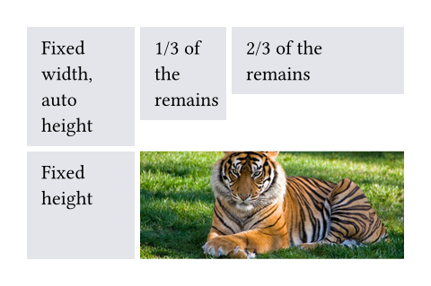
You can also spread an array of strings or content into a grid to populate its cells.
Styling the grid
The grid and table elements work similarly. For a hands-on explanation, refer to the Table Guide; for a quick overview, continue reading.
The grid's appearance can be customized through different parameters. These are the most important ones:
alignto change how cells are alignedinsetto optionally add internal padding to cellsfillto give cells a backgroundstroketo optionally enable grid lines with a certain stroke
To meet different needs, there are various ways to set them.
If you need to override the above options for individual cells, you can use the grid.cell element. Likewise, you can override individual grid lines with the grid.hline and grid.vline elements.
To configure an overall style for a grid, you may instead specify the option in any of the following fashions:
- As a single value that applies to all cells.
- As an array of values corresponding to each column. The array will be cycled if there are more columns than the array has items.
- As a function in the form of
(x, y) => value. It receives the cell's column and row indices (both starting from zero) and should return the value to apply to that cell.
On top of that, you may apply styling rules to grid and grid.cell. Especially, the x and y fields of grid.cell can be used in a where selector, making it possible to style cells at specific columns or rows, or individual positions.
Stroke styling precedence
As explained above, there are three ways to set the stroke of a grid cell: through grid.cell's stroke field, by using grid.hline and grid.vline, or by setting the grid's stroke field. When multiple of these settings are present and conflict, the hline and vline settings take the highest precedence, followed by the cell settings, and finally the grid settings.
Furthermore, strokes of a repeated grid header or footer will take precedence over regular cell strokes.
Accessibility
Grids do not carry any special semantics. Assistive Technology (AT) does not offer the ability to navigate two-dimensionally by cell in grids. If you want to present tabular data, use the table element instead.
AT will read the grid cells in their semantic order. Usually, this is the order in which you passed them to the grid. However, if you manually positioned them using grid.cell's x and y arguments, cells will be read row by row, from left to right (in left-to-right documents). A cell will be read when its position is first reached.
#grid(
  columns: auto | int | relative | fraction | array,
  rows: auto | int | relative | fraction | array,
  gutter: auto | int | relative | fraction | array,
  column-gutter: auto | int | relative | fraction | array,
  row-gutter: auto | int | relative | fraction | array,
  inset: relative | array | dictionary | function,
  align: auto | array | alignment | function,
  fill: none | color | gradient | array | tiling | function,
  stroke: none | length | color | gradient | array | stroke | tiling | dictionary | function,
  children
) -> content
Parameters
Prop
Type
Definitions
A cell in the grid. You can use this function in the argument list of a grid to override grid style properties for an individual cell or manually positioning it within the grid. You can also use this function in show rules to apply certain styles to multiple cells at once.
For example, you can override the position and stroke for a single cell:
You may also apply a show rule on grid.cell to style all cells at once, which allows you, for example, to apply styles based on a cell's position. Refer to the examples of the table.cell element to learn more about this.
#grid.cell(
  body,
  x: auto | int,
  y: auto | int,
  colspan: int,
  rowspan: int,
  inset: auto | relative | dictionary,
  align: auto | alignment,
  fill: none | auto | color | gradient | tiling,
  stroke: none | length | color | gradient | stroke | tiling | dictionary,
  breakable: auto | bool
) -> content
Parameters
Prop
Type
A horizontal line in the grid.
Overrides any per-cell stroke, including stroke specified through the grid's stroke field. Can cross spacing between cells created through the grid's column-gutter option.
An example for this function can be found at the table.hline element.
#grid.hline(
  y: auto | int,
  start: int,
  end: none | int,
  stroke: none | length | color | gradient | stroke | tiling | dictionary,
  position: alignment
) -> content
Parameters
Prop
Type
A vertical line in the grid.
Overrides any per-cell stroke, including stroke specified through the grid's stroke field. Can cross spacing between cells created through the grid's row-gutter option.
#grid.vline(
  x: auto | int,
  start: int,
  end: none | int,
  stroke: none | length | color | gradient | stroke | tiling | dictionary,
  position: alignment
) -> content
Parameters
Prop
Type
A repeatable grid header.
If repeat is set to true, the header will be repeated across pages. For an example, refer to the table.header element and the grid.stroke parameter.
#grid.header(
  repeat: bool,
  level: int,
  children
) -> content
Parameters
Prop
Type
A repeatable grid footer.
Just like the grid.header element, the footer can repeat itself on every page of the grid.
No other grid cells may be placed after the footer.
#grid.footer(
  repeat: bool,
  children
) -> content
Parameters
Prop
Type